

INTRO
Purple Bubble Tea is a locally operated business in Ajax. With limited recognition beyond the immediate community, its revenue relies primarily on local customers.
To address this, the website was redesigned to strengthen brand identity and improve usability.
I focused on refining typography, colour palette, visual hierarchy, and navigation to create a cohesive, professional, and user-friendly experience to make ordering easier.
Initial State Critique Video
CHALLENGES
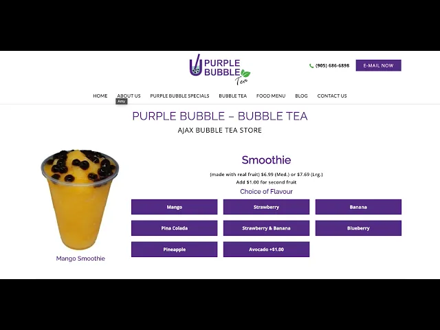
Inconsistent Branding: Typography, colors, and imagery lack cohesion, resulting in an unprofessional appearance.
Unclear Navigation: Inconsistent interactions and weak hierarchy make information hard to find.
Outdated Content: Minimal descriptions, outdated pricing, and vague labels reduce clarity and effectiveness.
No E-Commerce Functionality: The site is informational only and does not support online purchasing.
Address inconsistent branding by establishing a cohesive visual identity through consistent typography, accessible colours, and high-quality imagery.
Improve unclear navigation by refining the sitemap, page hierarchy, and interactive consistency.
Resolve outdated and unclear content by improving content clarity with accessible product descriptions, descriptive labels, and meaningful alt text.
Expand functionality through integrated e-commerce features and streamlined ordering experiences.


01.
Define
Website Review
The website was evaluated across three key areas:
Visual Design and Aesthetic
Website Usability
Content Quality and Communication
Accessibility


Identifying Customer Priorities
Menu and pricing should be the primary homepage focus and top navigation items.
More food/drink photos increase ordering intent.
Users want clearer pricing and promotions, including bundle deals.

02.
IDeate
Original Sitemap
The original sitemap is difficult to navigate because:
Not user-task driven: Key actions aren’t prioritized.
Not task-focused: Menu, pricing, and ordering aren’t prioritized.
Overly granular menu: Too many categories slow scanning and decision-making.
Inconsistent grouping: Related content is split across sections.


New Sitemap
The updated sitemap is easier to follow because it simplifies the site into a clear, predictable hierarchy structure:
Four clear primary paths (About, Promotions, Drink Menu, Contact).
Grouped content reduces fragmentation, clicks, and scanning time.
Information Architecture
About us: build trust and learn the brand story.
Menu: browse and customize drinks to support faster decision-making.
Contact us: find essential details (location, hours, contact) quickly to support purchase intent.


03.
Design

Inspirations
For inspiration, I reviewed competitor sites such as The Alley, Tru Tea & Real Fruit.
Based on these references, I added new sections including:
Ingredients section
Value section
Community/Reviews section
Contact section
Best Sellers section

Design System
Purple was overused on the original site.
So I repositioned it as a secondary color and limited it to the navigation bar to highlight key calls to action.
Website Redesign
Home page
Visual Design & Aesthetics:
Cleaner layout with stronger hierarchy and spacing.
Consistent, high-quality drink imagery.
More controlled color use; purple functions as an accent for CTAs.


About page
Website Usability
“About” content is structured into clear sections (Story, Values).
Scannable layout reduces effort to understand the brand.
Consistent navigation makes it easy to return to key pages.
Menu page
Content Quality & Communication
Menu is structured by series (Signature, Fruit Tea) for easier scanning.
Pricing and size options are clearly presented for decision-making.
Food menu cross-link supports upsell and deeper browsing.


Contact page
Accessibility
Clear top navigation with simple, familiar labels → lowers cognitive load.
Buttons/CTAs are visually separated
Multiple ways to find key information

04.
Future improvement


Through this redesign, I learned to evaluate a website through three core lenses: visual aesthetics, usability, and communication, which helped me make clearer decisions and stay concise during redesign iterations.
The survey insights reinforced that customers prefer pages that combine images with clear text, and they respond best when the next step is obvious through prominent calls to action. Overall, this project showed me how strongly design choices can shape user behaviour and purchase intent.
For future improvement, I would focus on adding a direct ordering experience so the website is not only informational, but also functional, allowing customers to move from browsing to placing an order without leaving the site.


