banner
banner
banner
banner

INTRO

UniGo is a mobile app that helps University of Waterloo students navigate campus, with a focus on indoor wayfinding.

It addresses a key limitation of existing tools: they can get students to a building, but not reliably to the right room, especially within complex multi-floor layouts.

UniGo makes indoor navigation more straightforward and predictable, helping new students move around campus with confidence and spend less time feeling lost.


Tool

Figma

Procreate

Canva

Duration

Sept 2025 - Feb 2026

Team

1 design lead

1 UX designer

2 UI designer

My Role

Design lead

UX researcher

Tool

Figma

Procreate

Canva

Duration

Sept 2025 - Feb 2026

Team

1 design lead

1 UX designer

2 UI designer

My Role

Design lead

UX researcher

CHALLENGES

  • Complex layouts and limited signage make campus navigation challenging for students.


  • General mapping apps do not reliably support indoor navigation.


  • Compass-based directions (e.g., north, east) are confusing for many students.


  • New students often get lost on campus, leading to late arrivals for classes.

SOLUTIONS

SOLUTIONS

  • UniGo provides indoor navigation with clear, step-by-step directions, using precise language and optional voice guidance to help students navigate complex campus layouts efficiently.


  • UniGo features an indoor/outdoor mode switcher that integrates GPS and AR-based guidance, enabling seamless navigation throughout the campus.


  • Uses clear, directive language (e.g., left, right) instead of compass-based instructions, helping students understand directions more intuitively.


  • UniGo can reference familiar landmarks (e.g., cafés, libraries) rather than only building names, helping new students orient themselves more naturally in unfamiliar spaces.

Process

Process

Design Thinking

Research
Research
Research
Research
Research
Research

With the problem defined, we conducted interviews and observations to validate assumptions, uncover pain points, and define key design requirements.

01

01

01

With the problem defined, we conducted interviews and observations to validate assumptions, uncover pain points, and define key design requirements.

Interviews

Our target users are University of Waterloo students who navigate campus to find classrooms. We interviewed three students from different programs to understand their key challenges:


  • Get lost due to complex building layouts

  • Unfamiliar with less-visited campus areas

  • Floor maps lack clarity

  • Primarily rely on Google Maps

Personas
Personas
Personas

02.

02.

02.

Two user personas, Anna and George, were developed from interview insights, with each persona representing a group of students facing the following challenges:


  1. Anna is a busy commuter. She needs the fastest routes available so she can stay on schedule and avoid delays.

  2. George is a visual learner. He needs clear, image-based navigation so he can quickly recognize landmarks and easily find his classrooms.

User Flows

User Flows

After defining the user personas, user flows were created to better understand individual needs and how users move through the app. This helped identify essential features before moving into wireframes, including:


  • AR view mode & Live GPS

  • Customizable user preferences

  • Multiple ways to access the navigation page


Ideate
Ideate
Ideate

03.

03.

03.

User Flows

After defining the user personas, user flows were created to better understand individual needs and how users move through the app. This helped identify essential features before moving into wireframes, including:


  • AR view mode & Live GPS

  • Customizable user preferences

  • Multiple ways to access the navigation page


Key Features

Key Features

Key Features

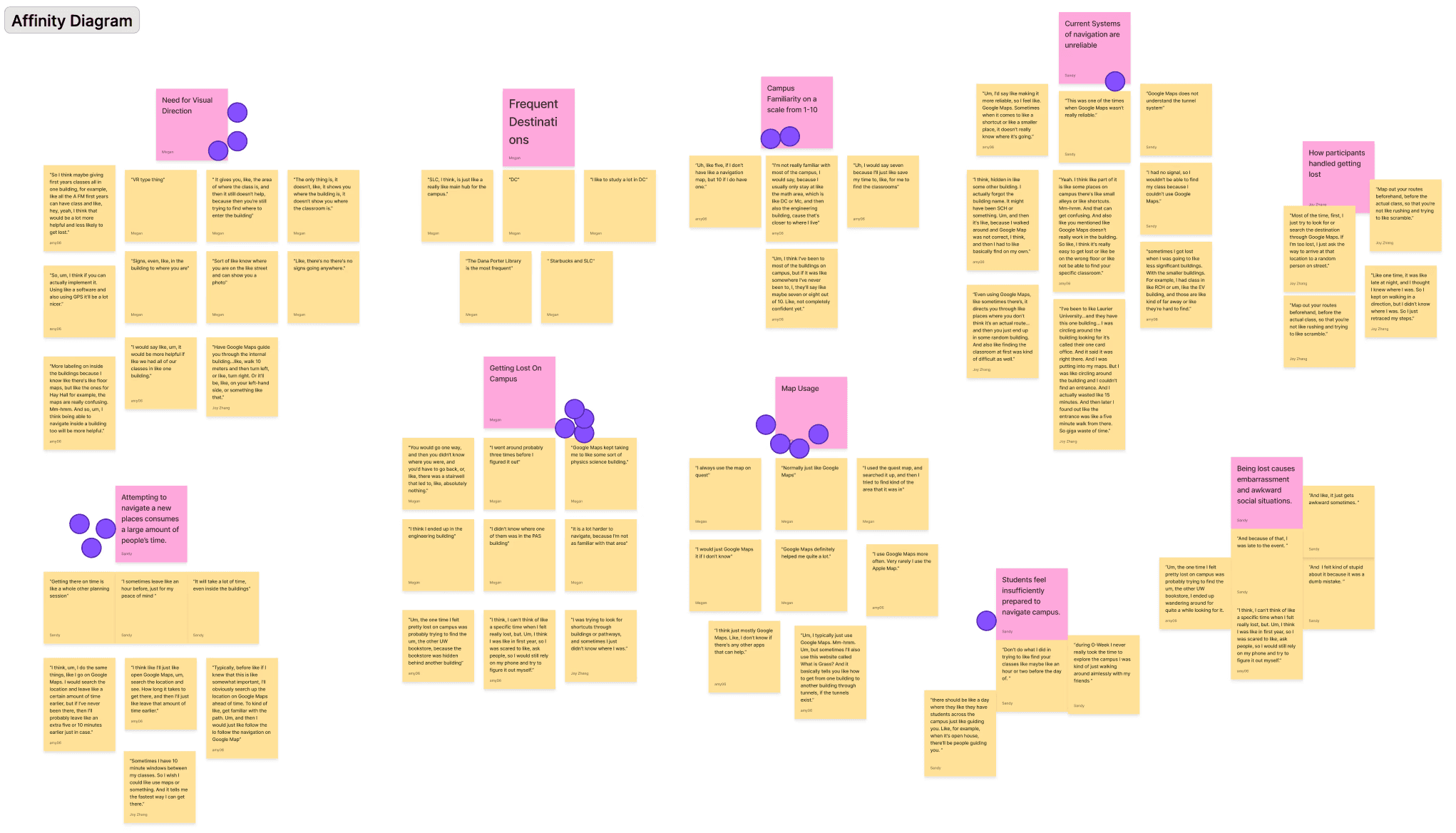
Research and interviews showed students struggle in unfamiliar campus areas. Based on user flows and personas, we defined three core features:

  • AR navigation with landmark cues

  • Accessibility preferences (avoid stairs/elevators)

  • AR ↔ GPS mode switching


Sitemap

Sitemap

Before diving into wireframes, I first mapped out the app’s structure. This allowed us to clearly visualize all features and screens, while also identifying any missing screens.
After finalizing the screens in our sitemap, I created two sketches using the Crazy 8s and 3 Solutions methods, which helped us refine the layout and structure before developing detailed wireframes.

Sketches

Inspirations

Inspirations

Inspirations

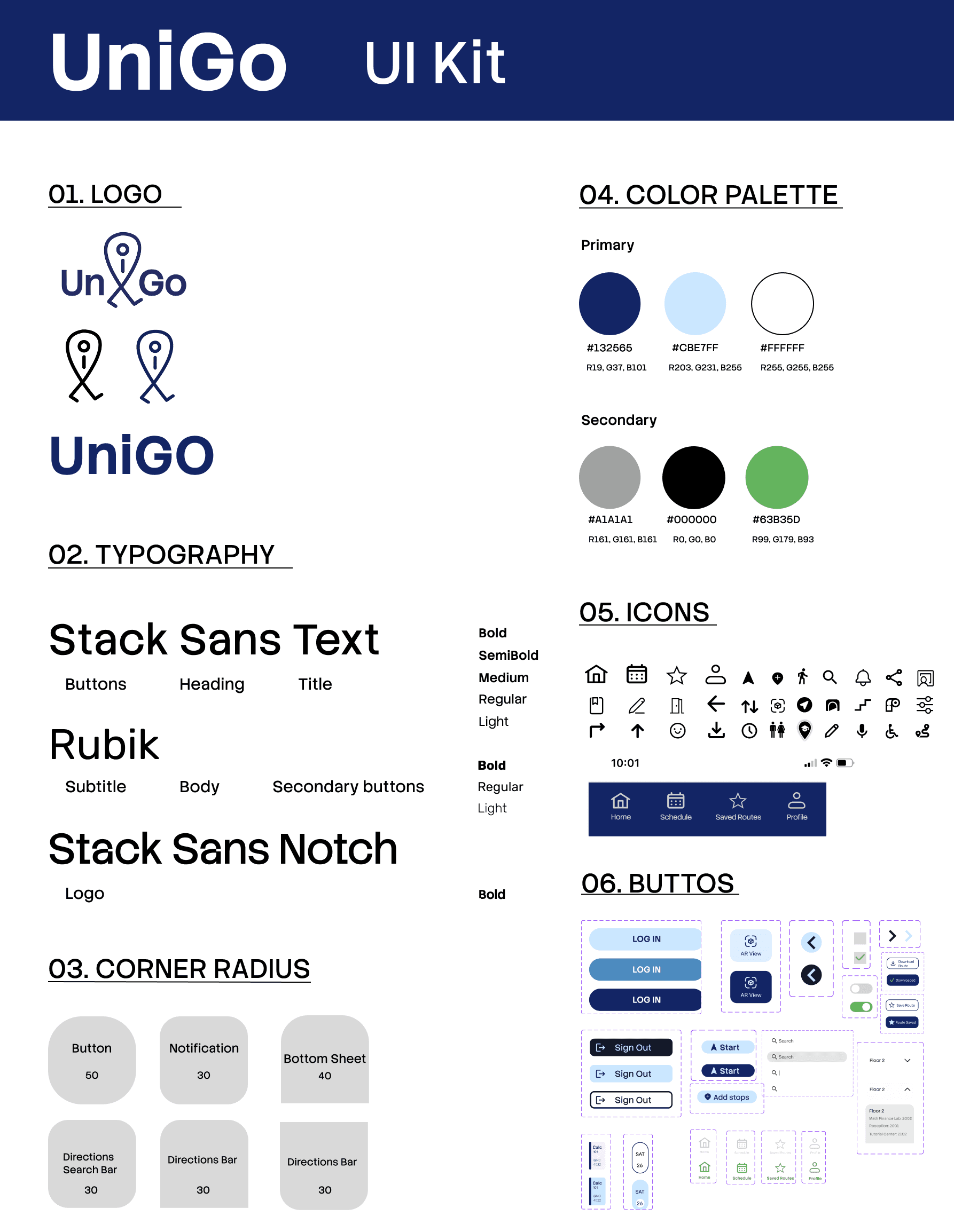
Blue is associated with trust and reliability, and its strong contrast makes route guidance easier to scan.

We anchored the palette on blue with green and grey accents, aligning with AODA accessibility goals for high-contrast, readable UI across diverse visual and cognitive needs.

How UniGo Differs From Existing Navigation Apps

  • Offers three indoor navigation modes to guide students through campus buildings.

  • Improves the "final-step" experience by using landmarks to confirm arrival and class details for smoother end-to-end navigation.

Prototype
Prototype

04

04

04

With these insights in mind, we translated the key pain points into design requirements and began prototyping key flows to test how UniGo could guide students through real campus routes.

Wireframe

Through wireframing, I first created a simple low-fidelity prototype to identify the core screens needed for UniGo.

Paper Prototype

Next, I used paper prototyping to refine the flow and add more features.

For example, I defined different map types to better support students with different needs.

Design System

We designed UniGo with accessibility principles in mind:

  • Clear, consistent wayfinding with high-contrast navy for primary navigation and text; green used as a secondary accent.

  • Typography is optimized for readability across screen sizes.

  • Interactive elements are clearly differentiated with defined states (default, hover, pressed, disabled).

Iteration

Iteration

In Scope

  • Include the navigation mode feature in our final design

Iteration 1

Out of Scope

  • Removed layout option (buildings already have layoutmaps)

Iteration 2

Key Features

What We Considered

  • Fast, familiar navigation

  • Live, visual directions

  • Customizable options

  • More specific directions

Prototypes

Testing
Testing

05.

05.

05.

Based on usability testing, we identified opportunities to improve:

  • Standardized toggles and inputs with green accents.

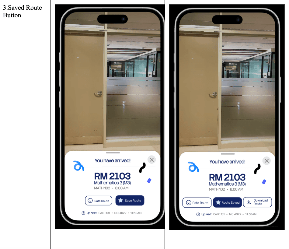
  • Added save confirmation plus offline/download access.

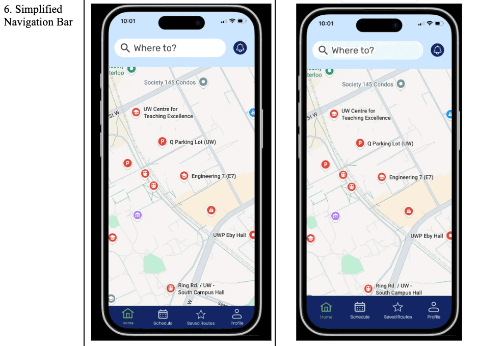
  • Refined spacing and label legibility on the navigation bar.

  • Introduced a search-first entry with clearer route details.

Visual Reference

Reflection

Reflection

This project successfully delivered a convenient, practical navigation experience for University of Waterloo students.
Usability testing was especially valuable, it highlighted the importance of visual consistency and route management, and those insights directly informed our design iterations.
If I continued the project, I would conduct broader testing across more buildings and accessibility needs, then refine edge cases such as multi-floor transitions and offline routing.
Longer term, I would scale UniGo beyond campus by expanding to the Waterloo region, potentially including Wilfrid Laurier University as a next deployment site.

Game Objectives

Game Objectives

Create a free website with Framer, the website builder loved by startups, designers and agencies.